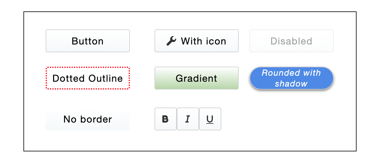
Button
A component which triggers an action when clicked.
Summary
The Button component can perform an action, when bound to a spreadsheet cell.

Usage
The usage is well-known. Button allows triggering literally any action when clicked:
Properties
- Button is repeatable;
- Styling properties: Background, Border, Shadows, Padding, Rotation, Layout settings;
- Interaction properties: Normal, Hover and Active behavior, Drag-n-Drop options;
- Component-specific properties:
- Type: Button or Link Button;
- Caption: Button text;
- Icons: Left and Right icon. Can be used with or without Caption;
- Disabled: enable or disable the button.