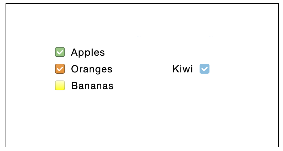
Checkbox
Standard checkbox component.
Summary
Standard checkbox component, which takes user input as a boolean value.

Usage
Add a checkbox to the page, link its "Checked" property to a spreadsheet cell.
Properties
- Checkbox is repeatable;
- Styling properties: Background, Rotation, Layout settings;
- Interaction properties: Drag-n-Drop options;
- Component-specific properties:
- Alignment: horizontal and vertical;
- Checked: is checked?;
- Disabled: is disabled?;
- Side: place icon to the left hand side (default) or to the right hand side.