'/%3E%3Cdefs%3E%3ClinearGradient id='paint0_linear' x1='0' y1='0' x2='0' y2='2160' gradientUnits='userSpaceOnUse'%3E%3Cstop/%3E%3Cstop offset='.1' stop-color='%23000' stop-opacity='0'/%3E%3Cstop offset='1' stop-opacity='0'/%3E%3C/linearGradient%3E%3C/defs%3E%3C/svg%3E%0A)
Common Styling Properties
Full list of common styling properties.
Alignment
Style up the component's alignment (works on controls containing text)
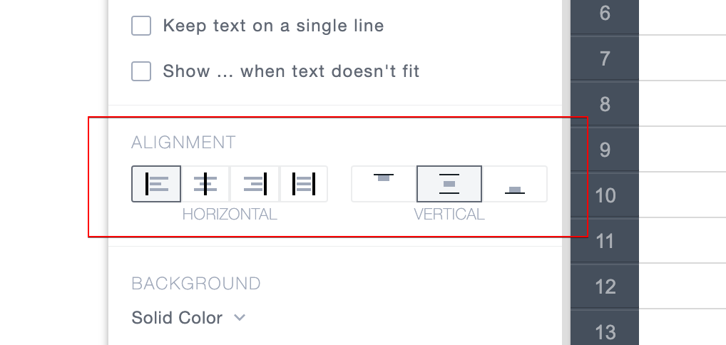
- Horizontal: left, center, right, justify;
- Vertical: top, middle, bottom.
Background
Style up the component's background.
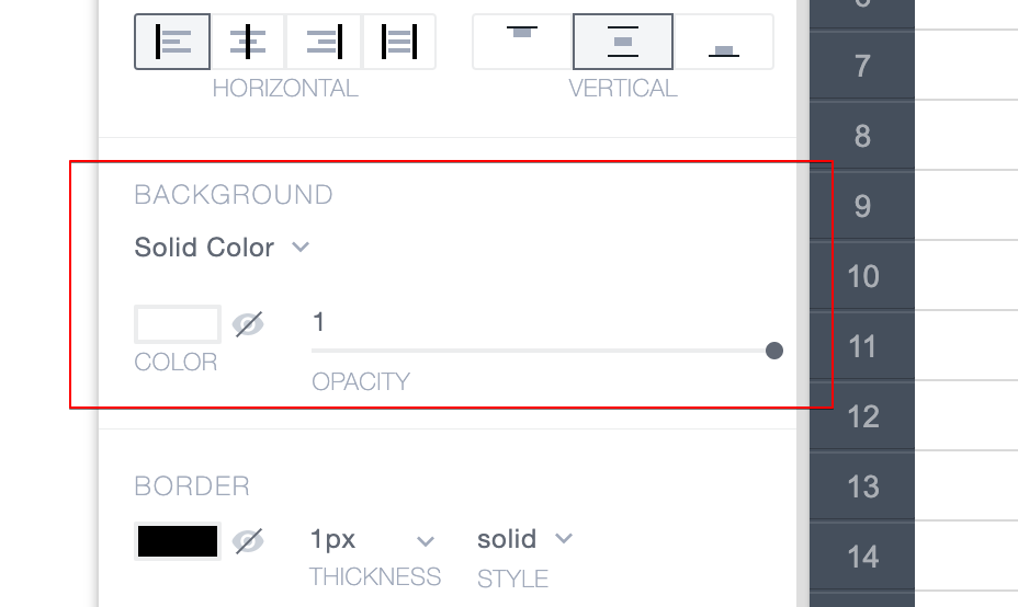
- Type: Solid Color or Linear Gradient;
- Color (two colors for gradient) selection;
- Visibility on/off;
- Opacity 0..1.
Border
Style up the component's border.
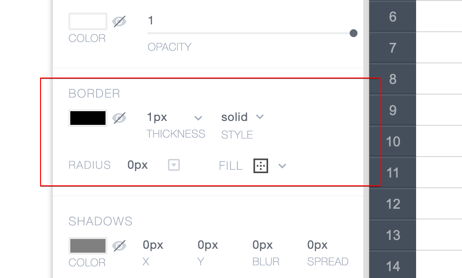
- Color;
- Visibility on/off;
- Thickness;
- Style: solid, dashed, dotted;
- Corner radius for all corners or individually for each;
- Fill: all sides, selected sides.
Shadows
Style up the component's shadows.
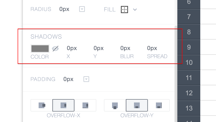
- Color;
- Visiblity on/off;
- X position;
- Y position;
- Blur value;
- Spread value.
Padding
Set up the component's paddings.
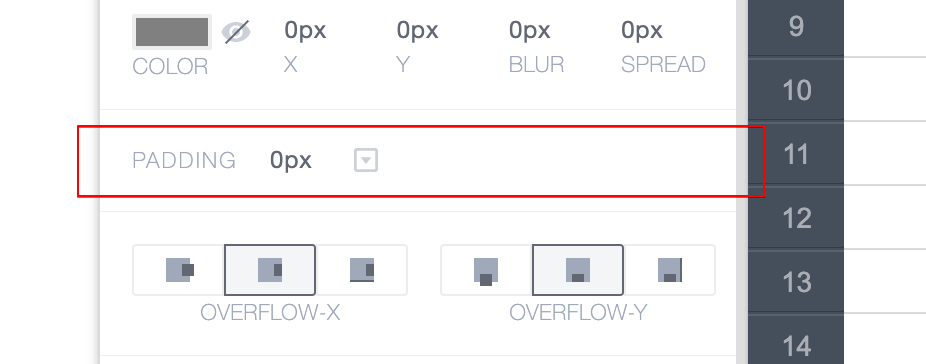
- All at once, or each side individually.
Overflow
Set up the component's overflow behavior.
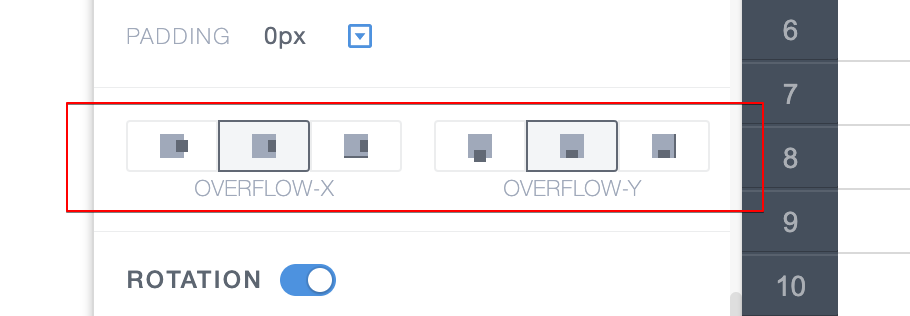
- X: Visible, Hidden, Auto;
- Y: Visible, Hidden, Auto.
Rotation
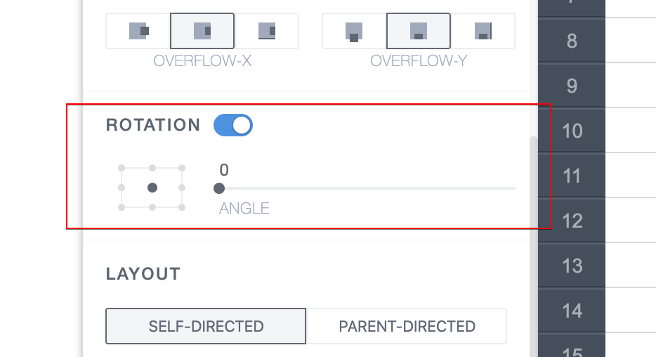
Set up the component's rotation.
- Rotation origin;
- Rotation angle;
- On/off.
Layout
Set up the component's layout.
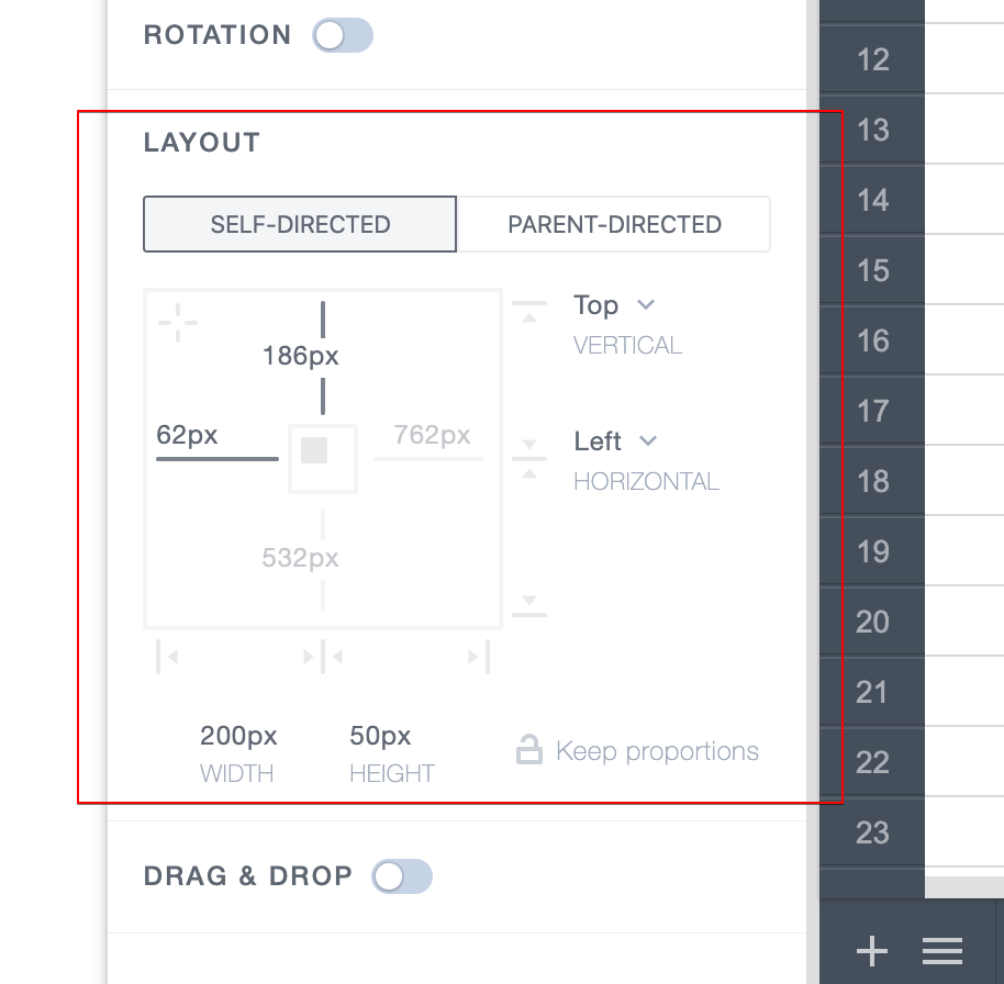
Self-directed layout
- Absolute values of the component coordinates;
- Enable "stickiness" to parent;
- Width and Height;
- Keep proportions.
Parent-directed layout
- Parent direction (row, column);
- Parent: distribute, alignment, wrap;
- Width value, min width, max width;
- Height value, min height, max height;
- Margin values + customize for Repeater first and last item;
- Advanced settings.